
Page 33 - joa-nov-22
P. 33
Warren Dotz’s Collection of Advertising Characters
WARREN DOTZ is an author of award-winning, graphic design books published by American and foreign imprints such as Random House,
Chronicle Books, Insight Editions, and Graphic Sha Japan. A theme common to his publications is the “Art of Commerce,” particularly package labels
and promotional illustrations. As a pop culture historian with a special interest in brand spokes-characters, his commentary has also appeared in notable
publications such as Advertising Age, Brandweek, and the New York Times Magazine. Artifacts from Warren’s collections have been displayed
in exhibitions in San Francisco and Japan and many of his books can be found in museum gift shops such as The Museum of Modern Art and
Centre Pompidou, Paris. Warren lives and works in San Francisco and New York City. His collection of advertising characters is one of the largest
in existence.
Some Background on the Emergence of Advertising Characters
Advertising characters are fascinating to study and
collect because they lie at the intersection of business,
design, and the modern mythology of pop culture. The
Jolly Green Giant is almost a modern-day harvest
god, if you think of it. In his early incarnations, he
represented foods that were healthful just as the
Quaker Oats Man represented purity and quality.
Characters like these represented a “value” and
this was a common selling point in nascent
American advertising.
As early modern-day advertising became
more refined, characters were developed to
specifically emphasize their products’ unique
selling proposition in relation to their
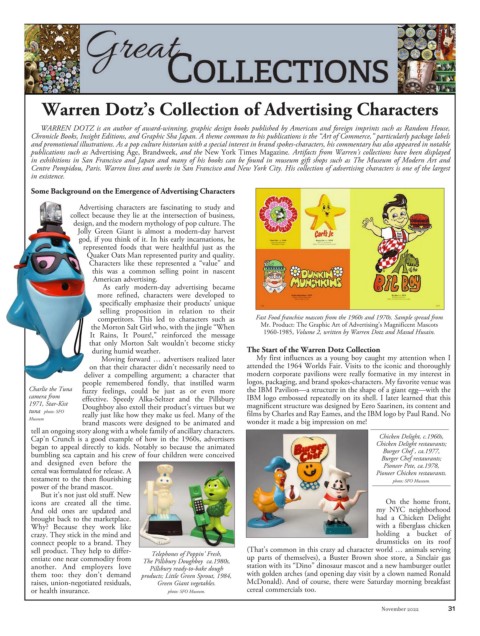
competitors. This led to characters such as Fast Food franchise mascots from the 1960s and 1970s. Sample spread from
the Morton Salt Girl who, with the jingle “When Mr. Product: The Graphic Art of Advertising’s Magnificent Mascots
It Rains, It Pours!,” reinforced the message 1960-1985, Volume 2, written by Warren Dotz and Masud Husain.
that only Morton Salt wouldn’t become sticky
during humid weather. The Start of the Warren Dotz Collection
Moving forward … advertisers realized later My first influences as a young boy caught my attention when I
on that their character didn’t necessarily need to attended the 1964 Worlds Fair. Visits to the iconic and thoroughly
deliver a compelling argument; a character that modern corporate pavilions were really formative in my interest in
people remembered fondly, that instilled warm logos, packaging, and brand spokes-characters. My favorite venue was
Charlie the Tuna fuzzy feelings, could be just as or even more the IBM Pavilion—a structure in the shape of a giant egg—with the
camera from effective. Speedy Alka-Seltzer and the Pillsbury IBM logo embossed repeatedly on its shell. I later learned that this
1971, Star-Kist
Doughboy also extoll their product’s virtues but we magnificent structure was designed by Eero Saarinen, its content and
tuna photo: SFO
really just like how they make us feel. Many of the films by Charles and Ray Eames, and the IBM logo by Paul Rand. No
Museum
brand mascots were designed to be animated and wonder it made a big impression on me!
tell an ongoing story along with a whole family of ancillary characters.
Cap’n Crunch is a good example of how in the 1960s, advertisers Chicken Delight, c.1960s,
began to appeal directly to kids. Notably so because the animated Chicken Delight restaurants;
Burger Chef , ca.1977,
bumbling sea captain and his crew of four children were conceived Burger Chef restaurants;
and designed even before the Pioneer Pete, ca.1978,
cereal was formulated for release. A Pioneer Chicken restaurants.
testament to the then flourishing photo: SFO Museum.
power of the brand mascot.
But it’s not just old stuff. New
icons are created all the time. On the home front,
And old ones are updated and my NYC neighborhood
brought back to the marketplace. had a Chicken Delight
Why? Because they work like with a fiberglass chicken
crazy. They stick in the mind and holding a bucket of
connect people to a brand. They drumsticks on its roof
sell product. They help to differ- Telephones of Poppin’ Fresh, (That’s common in this crazy ad character world … animals serving
entiate one near commodity from The Pillsbury Doughboy ca.1980s, up parts of themselves), a Buster Brown shoe store, a Sinclair gas
another. And employers love Pillsbury ready-to-bake dough station with its “Dino” dinosaur mascot and a new hamburger outlet
them too: they don’t demand products; Little Green Sprout, 1984, with golden arches (and opening day visit by a clown named Ronald
raises, union-negotiated residuals, Green Giant vegetables. McDonald). And of course, there were Saturday morning breakfast
or health insurance. photo: SFO Museum. cereal commercials too.
November 2022 31