
Page 30 - joa-6-23
P. 30
styles from the seventeenth to the early nineteenth centuries. Efforts
were made to create rooms that were “of the period.”
Writing to interior designer Henry Davis Sleeper in 1930, du Pont
stressed that at Winterthur he was “doing the house archaeologically
and correctly, and am paying the greatest attention even to the epoch
of fringes.” When creating window treatments, du Pont did indeed
refer to design books of the appropriate period as well as surviving
examples of historic valances. These, however, he would adapt to suit
the project at hand. At the end of the day, for du Pont, aesthetics always
trumped historic accuracy. In his own office, for example, he preferred
an 1830s chintz for curtains although the room was created with archi-
tectural paneling from a 1790 addition to a house built in 1760. The
dates didn’t fit, but the mix looked “right.” In effect, du Pont was
creating beautiful installations that featured his extraordinary collection.
The English paste-printed cotton (1770) in the Hampton Room
features exotic flowers and undulating vines that complement the
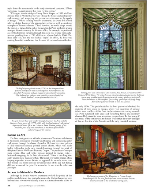
style of the furnishings and add a dynamic element to the decoration. Striking green-and-white striped satin curtains dress the bed and windows of the
The bedhangings, valances, and material were purchased from Gold and White Room. The stripes form an attractive diagonal pattern when fashioned
Bertha Benkard’s estate after her death in 1945. into a swag installed inside the early nineteenth century window trim from the
Peter Breen house in Philadelphia. Eye-catching, spool-shape silk fringe hangs
from lattice-patterned threads to trim the valances.
the early 1900s. The specialist dealers du Pont patronized obtained the
majority of their stock in Europe, where vast quantities of antique
fabrics were readily available from the late nineteenth century onward.
Du Pont purchased both dress and furnishing fabrics and routinely
disassembled pieces for reuse as curtains or upholstery. In fact, many, if
not most, of the textiles used to furnish Winterthur never saw the light
In April through June and October through December, du Pont used this of day on this side of the Atlantic until the early twentieth century.
blue-green Satin woven silk (1775-1800) with hand-painted and embroidered
vignettes of Chinese life in the Latimeria Room. Limited yardage of this
handsome piece may have contributed to the choice of the shallow,
scalloped shape for the valance.
Rooms as Art
Du Pont took great care with the placement of furniture and objects
in his rooms, striving for symmetry and balance and introducing color
and pattern through the choice of textiles. He loved the color palettes
of mid-nineteenth-century printed cotton chintz, which was made
highly fashionable in the early twentieth century through the work of
designers Elsie de Wolfe and Dorothy Draper. The patterns of antique
paste prints—blue and white cottons printed in indigo resist—
he found intriguing. As du Pont often noted, “Color is the thing that
really counts more than any other.” He fussed over subtle shades, often
keeping expensive historic fabrics on approval for months to see how
they looked in a room not only at various times of the day but during
different seasons of the year. He wanted to be sure that the color was
just right.
Access to Materials: Dealers
Although du Pont’s window treatments evoked the period of the Wool moreen reproduced for Winterthur in France through
architectural elements in a particular room, the fabrics themselves bore Brunschwig & Fils was used for the fall and winter rotation curtains,
little relation to what was actually in use in America from the 1700s to which were made in the Winterthur sewing room.
28 Journal of Antiques and Collectibles