Page 34 - joa-1-22R
P. 34
Around                                                                          with


                                        the                                                    Art


                    House                                                                      Deco


             By Donald-Brian Johnson • Photos by Leslie Piña                                               Sssssscintillating. Sandoz Cobra Vase, 1928.


                                                                     “Art Deco was the last truly sumptuous style.”

                                                                                   – Alastair Duncan, Art Deco, 1988

                                                                         rt Deco. It isn’t all black and white. Or zigzags
                                                                       and chrome. Or uncluttered lines and
                                                                 A uncompromising furniture.
                                                                    Often, how we view the past is dependent upon
                                                                 what’s available for viewing today. We see Fred Astaire
                                                                 and Ginger Rogers click-clacking their way through a
                                                                 1930s movie musical. He’s in a sleek black tuxedo.
                                                                 She’s in flowing white satin. There’s a gleaming black
                                                                 dance floor, framed by white draperies hung with
                                                                 geometric precision. Surrounding it, at tiny,
                                                                 uncomfortable-looking cocktail tables, are formally
                                                                 attired partygoers (in black and white, of course). The
                                                                 movie itself, as you may have guessed, is also in
                                                                 black and white. Deep, rich, impenetrable blacks.
                                                                 Unsullied, blazing, eye-averting whites. The cinema-
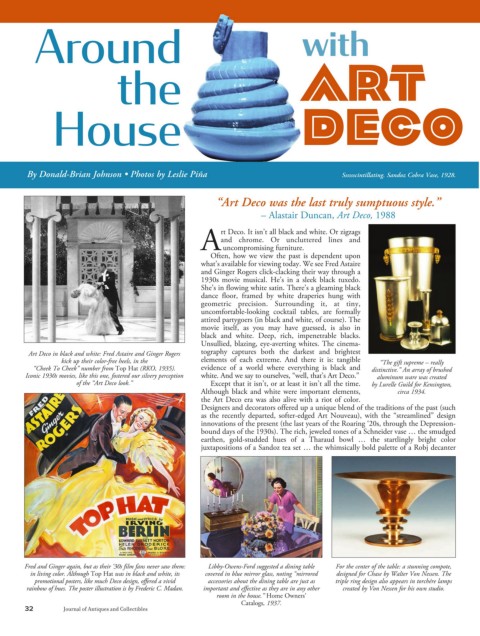
             Art Deco in black and white: Fred Astaire and Ginger Rogers   tography captures both the darkest and brightest
                       kick up their color-free heels, in the    elements of each extreme. And there it is: tangible     “The gift supreme – really
              “Cheek To Cheek” number from Top Hat (RKO, 1935).    evidence of a world where everything is black and   distinctive.” An array of brushed
            Iconic 1930s movies, like this one, fostered our silvery perception   white. And we say to ourselves, “well, that’s Art Deco.”    aluminum ware was created
                           of the “Art Deco look.”                  Except that it isn’t, or at least it isn’t all the time.   by Lurelle Guild for Kensington,
                                                                 Although black and white were important elements,          circa 1934.
                                                                 the Art Deco era was also alive with a riot of color.
                                                                 Designers and decorators offered up a unique blend of the traditions of the past (such
                                                                 as the recently departed, softer-edged Art Nouveau), with the “streamlined” design
                                                                 innovations of the present (the last years of the Roaring ‘20s, through the Depression-
                                                                 bound days of the 1930s). The rich, jeweled tones of a Schneider vase … the smudged
                                                                 earthen, gold-studded hues of a Tharaud bowl … the startlingly bright color
                                                                 juxtapositions of a Sandoz tea set … the whimsically bold palette of a Robj decanter


            Fred and Ginger again, but as their ‘30s film fans never saw them:   Libby-Owens-Ford suggested a dining table    For the center of the table: a stunning compote,
              in living color. Although Top Hat was in black and white, its    covered in blue mirror glass, noting “mirrored   designed for Chase by Walter Von Nessen. The
               promotional posters, like much Deco design, offered a vivid    accessories about the dining table are just as   triple ring design also appears in torchére lamps
            rainbow of hues. The poster illustration is by Frederic C. Madan.  important and effective as they are in any other   created by Von Nessen for his own studio.
                                                                      room in the house.” Home Owners’
                                                                             Catalogs, 1937.
            32               Journal of Antiques and Collectibles

