
The Broadway Poster
By Daniel Jay Grimminger, Ph.D
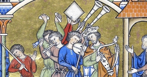
Music has always gone hand in hand with the visual arts. Iconography, or visual images, is of importance since music itself – after it was passed on simply by oral means – is realized from a written or printed page. Music is, by its very nature, iconographic. But, the extra-musical images, which sometimes accompany musical events and music performance, always have a modus operandi. Hand illuminations that found their way into Gregorian manuscripts served a fiduciary function as they reinforced theological messages. Sheet music covers often conveyed political and social meanings as they helped sell the printed music.
Music magazines inspired students through a cover illustration that often involved color or a featured composer. Broadway show, operetta, and opera posters helped to market musical works and performances. During the Golden Years of the Broadway Musical (1943-1959), posters were a highly effective marketing tool, aimed largely at women, containing larger themes like romantic relationships.
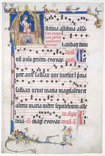
The monks who copied out the manuscripts in their scriptoria created finely uniform lettering and detailed illuminations, which would have spoken to those religious and highly faithful Christians of the Middle Ages (ca. 200-1450). The illuminated letters depicting saints and angels in tempura colors were meant to inspire awe in the everyday lives of Christians; they expressed the beauty of God and helped the faithful to express their faith.
Each individual neume (musical note) and each illuminated letter were a theological expression in iconographic form, much better and effective than any written word could be since these images were formed from the creative juices of the artist’s soul.
Sheet Music Covers: Political Icons
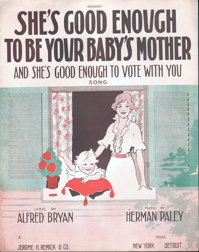
Possibly the most effective iconography used in connection with music was sheet music covers. Virtually every house in America had a piano and the sheet music that was stored in music cabinets and piano benches was used by publishers and printing houses to market their products. Topical content and colors were employed by artists to make these covers appealing (in many cases far more appealing than the music contained in the publication!).
These covers were indeed a marketing tool, but they were an even greater expression of social and political ideas. For example, women’s suffrage was promoted through sheet music covers in subtle and pronounced ways. Because women were the main consumers of sheet music and because this music would have been displayed at times on the music stand of the piano in the parlor room, the images appealed mostly to women and their interest in democracy and a transformation of the gender norms of previous generations.
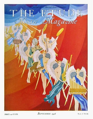
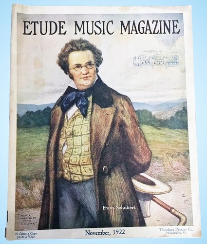
Music magazines were an important pedagogical tool in the music studio. Many teachers used them when instructing students (either by applying what they read in the magazines or by assigning pieces of music from the periodicals as their students’ assignments). One of the most important examples in twentieth-century America was The Etude. This magazine was notorious for its covers. Often a composer whose compositional works were most prominent in an issue was featured on the cover. In the 1920s and 30s the use of color and imaginary figures inspired students to open the magazine. The covers made the pedagogical process more interesting to the student and teacher alike.
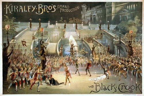
Broadway Posters: Marketing Icons
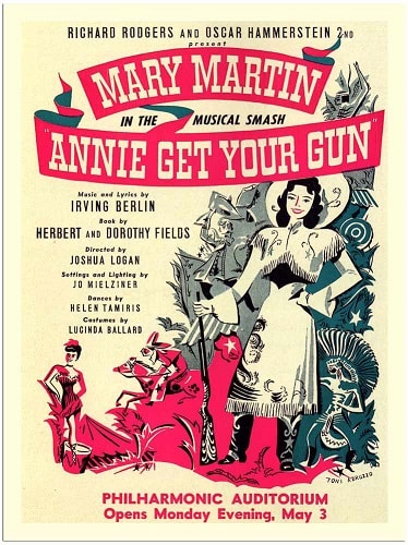
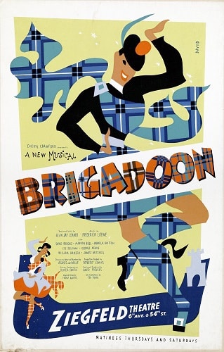
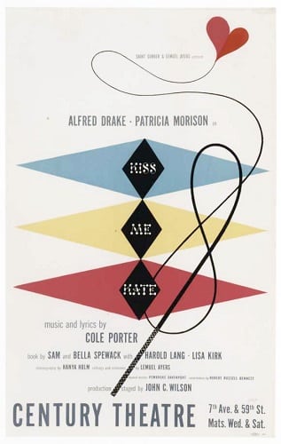
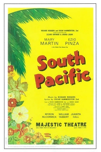
Yet another form of musical iconography is the Broadway poster. Every musical that was produced during the Golden Age of Broadway musicals (1943-1959) had an accompanying poster, which served the foundational purpose of “depicting the essential theme or story motif …” It was not merely a “factual advertisement, no matter how visually attractive.” Posters of the day, appeared “… in stores and store windows; at the entrance of places of amusement and entertainment; on buses and streetcars in the form of car cards; in subways; on the back of taxis and the sides of trucks; along the highways as billboards … [they were] a very colorful part of travel bureaus; airline, railway and bus terminals … [they were] seen announcing the latest in movies, plays, and aspirin, on the approaches to a big city; selling feed and seed, on the side of a barn in the country.” Above all, the poster called “tersely” upon the reader “to buy, try, drink, think, visit, travel, see, walk, run, drive, fly, cruise, taste, feel, smell … hawking the wares and services of manufacturers and businesses.”
Posters and other ephemeral items produced for Broadway shows during the golden era were part of a larger ethos of advertisement that cashed in on the American longing for “the way things had been before.” Post WWII advertising either tried to present a “dignified explanation of what was being sold” or added humor in order to sell the public on an idea or product. Becase many more women had been introduced into the pay economy during the war years, they became targets even more during Broadway’s golden age. This may explain why underlying themes of gender and sexuality (as in Gypsy, 1959, and Annie Get Your Gun, 1946) and Relationships (as in Kiss Me, Kate, 1948, and My Fair Lady, 1956) were an integral part of many shows and their posters.
Iconography on postwar Broadway posters aimed at “normalcy, realistic representational art … Figures were not stylized, and images were not shocking.” Indeed, this was the calm after the storm; it helped to give the American public a stable and wholesome way to pass their time as the country tried to return to normal again after the war.


Throughout the ages, music teamed up with the visual arts. This goes as far back as antiquity, but we see the most evidence for this pairing from the Middle Ages to the current day. We especially see the Broadway Musical poster as a treasure that exemplifies this very old relationship. What may be the most remarkable aspect of musical iconography in all its forms is that it survived! It beat the odds! Thankfully, people thought highly enough of these things that they preserved them regardless of their ephemeral designation by their makers.
Music and Icon
Sponsored

Related posts: