by Richard Sheaff
In the days before the profession of “graphic design” came into existence, commercially printed work nonetheless sometimes displayed a surprising degree of sophistication. That sophistication came from the talents of typesetters and printers and engravers, none of whom would have titled himself or herself as a “graphic designer.”
For far too many decades, the term “Victorian design” has been something of a pejorative, a somewhat dismissive term which assumed that the Victorian era was an era of visual wretched excess, of little but smarmy, flowery, overly sentimental, cluttered design. Some of this evaluation emerged from the fine arts world of the 1930s and ‘40s and ‘50s. Artists and typographers and budding designers were instilled with what was seen as a radically different aesthetic – clean, modern, minimalist, gridded, san serif. Form follows function. Decoration was dismissed as totally unnecessary clutter and a hindrance to clarity of expression. But in more recent years, designers and typographers are looking back to the Victorian era with increasing enthusiasm, and finding things to like, things to learn. Popular styles change constantly, and those changes are reflected in the fine arts and in the commercial arts.
When it comes to vintage printed ephemera, commercial printers used a succession of printing technologies, each with its inherent advantages and disadvantages relative to the others. And for their own self-promotion, top printers pulled out all the stops and created trade cards that dazzled.
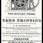
From Gutenberg’s invention of movable type in 1439 through the early- to mid-1800s, most printing was letterpress printing, and most of it was book printing. By and large, printers printed books. When they would print something more ephemeral – such as a broadside or a paper “trade card” or a poster – they used their familiar handful of book fonts in their traditional way – mostly centered line over centered line. Each individual “type high” letter of metal type or border element (“type high” being slightly under an inch: .9186”) was locked up in a form, with all the assembled elements tightly wedged horizontally and vertically to hold them in position. The top “type high” surface was inked, and pressed onto paper to make a printed impression.
Copperplate Engraving
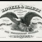
In copperplate engraving, designs were incised into copper, ink dabbed into the recessed gouges, the top surface wiped clean, and paper pressed down under great pressure so that the ink in the recessed design transferred onto the paper. Early copperplate designs were generally simple, a scene or heraldic device along with some wording. Over time, some of this work became quite elaborate. Unlike in letterpress printing, copperplate engravers were able to create freehand flowing lines and flourishes, even draw scenes. The wording could be drawn in custom letter styes. A copperplate engraver was not constrained by the limitations of pre-cast metal type.
Steel Engraving
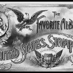
Steel engraving is essentially the same process as copperplate engraving, except that steel is harder than copper, which meant that engravers could create finer detail in their designs. More impressions could be made from a steel engraved plate than from a copper engraved plate before the metal wore down to the point where details begin to disappear. In steel engraving, the engraver did his work on a relatively soft steel (though even that soft steel was harder than copper); once the design was complete, the steel was heat-hardened to make it quite resistant to wear. But what began to occur – beginning with copperplate engraving, increasing with steel engraving and, later, commercial wood engraving – was a growing cultural taste for (and acceptance of) increasingly elaborate and/or pictorial designs. No longer constrained by the grid of the letterpress lockup, engravers increasingly integrated their words and images, products and scenes, complex decorations and stylized, elaborate letterforms. Design elements could be and were allowed to flow over, under, around, and into each other. The illusion of three dimensionality became commonplace, with letters and banners and ribbons presented as if layered and casting shadows. Steel engraved pieces are said to have “the feel of steel,” because a finger gently moved over the surface can detect the raised ridges of the design transferred out of the recesses in the engraved plate.
Wood Engraving
Whether engraved into copper, steel or wood, engravers enjoyed increased freedom of artistic expression. All were “relief” processes – the designs were cut (and backwards, by the way) to a depth below the surface. [As an aside, the distinction is made between wood engraving – engraving into the hard end grain of a hard wood like boxwood – and woodcuts, incised in the softer grain on the side of a plank.] With wood engraving – more so than with copper or steel plates – it became common that the final printed piece be a combination of wood engraving and metal (or wood) type, because wood engraving was generally created “type high” and thus could be locked up together with type elements in standard letterpress forms. A bit later, as lithography replaced engraving, previously engraved “cuts” were commonly reproduced by lithography, which is a “surface” printing technique: all details are on essentially the same level. Lithographic printers soon figured out various ways to transfer designs originally engraved in copper, steel or wood onto their litho stones and – later – litho plates.
Crayon lithography – the drawing of designs directly on extremely smooth limestone using black greasy crayon – was invented by Alois Senefelder in 1796. Lithographic printing, then and now, depends upon the fact that oil and water do not mix. Inks are attracted to the areas meant to print and repulsed in the areas that should not print. Early lithography was black ink on white paper. As the 19th century progressed, lithographic artists of increasing skill developed the amazing ability of analyzing a full color painted original, breaking it down in their minds into its component colors, then drawing by hand on separate stones – each in black crayon – one stone for each planned color. They could do this with such skill that when printed sequentially, one carefully registered color at a time, the additive end result would be a full color image that would closely match the original reference art. This was a mind-boggling feat of technical and artistic skill.
Artistic Printing
The term “Artistic Printing,” though occasionally used by printers of all sorts, was an 1880s term adopted by letterpress printers, who pulled a number of tricks out of their sleeves to try to compete with developing lithographic technologies which were inherently more free-flowing, more able to mix and to layer elements. Chromolithography – with its dazzling color exploding into a world previously 95% black and white – was a major threat to letterpress job printers.
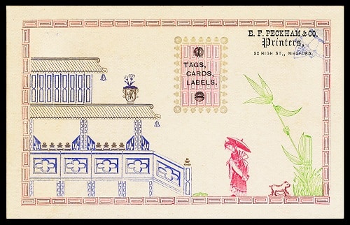
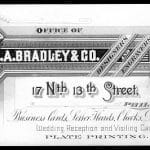
Though still constrained by the necessity of locking up everything that was to print in a rectangular form, certain letterpress printers pioneered techniques to layer colors and tints, incorporate curved and diagonal brass elements, create ribbon-like effects and execute complex design arrangements. Such “Artistic Printing” required exceptional make-ready and printing skills. This caliber of work, most of it done between 1879 the early 1890s, was striking in its technical complexity. The finest examples appear on the trade cards of the the letterpress printers themselves.
These Artistic letterpress printers created several specimen exchange programs. The idea was to showcase and exchange ideas and techniques. The longest-running of these was the Printers International Specimen Exchange, which produced 16 exchange volumes between 1880 and 1898. It was originated by British printer Andrew Tuer, who stated at the outset – among other things – that “Good typography concerns every man, woman, and child who can read. Printers would do well to recollect that in technically educating themselves they are educating the masses – for printing is closely allied to the fine arts, and by the production of better work the national taste is elevated and society at large benefited.” Some 400 printers printed 400 copies of one strong design, and the collected leaves were assembled into 400 specimen books which were then distributed back to each contributor. The contributing printers were primarily American, British and German. For the 1879-1880 first volume, there were 400 participants; by the 1890s submissions had dropped dramatically as letterpress lost the commercial battle to lithography and halftone printing, and interest in commercial letterpress “Artistic Printing” faded away.
Stylistically, an aspect of printing in the second half of the 19th century was the popularity, throughout American and Europe, of design motifs from Japan, China, the Orient in general, and Egypt. This fascination sprang from the preoccupations of the Aesthetic Movement, from the opening of Japan to the West by Commodore Perry in 1853, from the opening of China to the West from the 1840s on, from the popularity of The Mikado (a Gilbert and Sullivan comic opera which first opened in 1885), and from the many archaeological discoveries being made at the time in Egypt, Persia and the Mideast. These exotic influences can be seen throughout the printing and commercial designs of the era.
Dick Sheaff, currently President of The Ephemera Society of America (ephemerasociety.org), is a retired graphic and communications designer who also designed or art-directed over 500 U.S. postage stamps. He collects and researches many sorts of ephemera, with a particular interest in vintage design and typography. Dick has a personal ephemera-related, non-commercial website (sheaff-ephemera.com).






Related posts: