Around the House with Art Deco
By Donald-Brian Johnson • Photos by Leslie Piña
“Art Deco was the last truly sumptuous style.”
– Alastair Duncan, Art Deco, 1988

Art Deco. It isn’t all black and white. Or zigzags and chrome. Or uncluttered lines and uncompromising furniture.
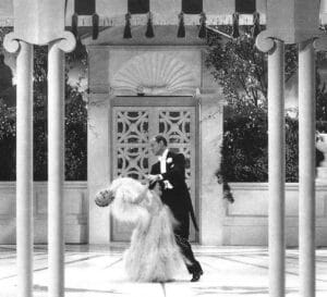
Often, how we view the past is dependent upon what’s available for viewing today. We see Fred Astaire and Ginger Rogers click-clacking their way through a 1930s movie musical. He’s in a sleek black tuxedo. She’s in flowing white satin. There’s a gleaming black dance floor, framed by white draperies hung with geometric precision. Surrounding it, at tiny, uncomfortable-looking cocktail tables, are formally attired partygoers (in black and white, of course). The movie itself, as you may have guessed, is also in black and white. Deep, rich, impenetrable blacks. Unsullied, blazing, eye-averting whites. The cinematography captures both the darkest and brightest elements of each extreme. And there it is: tangible evidence of a world where everything is black and white. And we say to ourselves, “well, that’s Art Deco.”

Except that it isn’t, or at least it isn’t all the time. Although black and white were important elements, the Art Deco era was also alive with a riot of color. Designers and decorators offered up a unique blend of the traditions of the past (such as the recently departed, softer-edged Art Nouveau), with the “streamlined” design innovations of the present (the last years of the Roaring ‘20s, through the Depression-bound days of the 1930s). The rich, jeweled tones of a Schneider vase … the smudged earthen, gold-studded hues of a Tharaud bowl … the startlingly bright color juxtapositions of a Sandoz tea set … the whimsically bold palette of a Robj decanter … all of these existed concurrently with the shimmering modernity of Chase chrome, the brushed splendor of Kensington aluminum, and the opaque solemnity of Frankart nudes. Opposite poles of the visual spectrum collided, propelled by an explosion of artistic energy. That’s why Art Deco design is so satisfying and has such longevity. It offers, quite literally, something for everyone.
Domestic Deco
A case in point: Art Deco items for the home. While some serve a purely decorative function, the majority incorporate usefulness into their art. That’s because manufacturing firms were faced with a Depression-based dilemma. Bowls, plates, coffeepots, vases, and other home accessories had been around for ages. What could possibly persuade buyers in a depressed economy to purchase new items, when older ones were still performing reasonably well? The answer was to promote the new as “improved” versions of the old, efficiently addressing the three concerns of primary importance to consumers: usefulness, cost, and appearance. That task fell to a Deco-spawned new breed: the industrial designer.
Generally contracted as free agents, these wonder-workers were sought after by companies that turned out products as diverse as washing machines, automobiles, porch furniture, and refrigerators. The talent of the industrial designer was an uncanny ability to modernize the mundane – and to do so without compromising form or function.
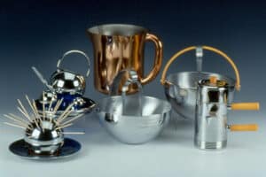
Leading the industrial design pack was the Chase Brass & Copper Co. From 1933 to 1942, Chase turned out a gleaming (and seemingly endless), array of buffet service articles, drinking and smoking accessories, lamps, and assorted home décor items. Fashioned primarily of brass, copper, or the newly popular chromium, these “Chase Specialties” were truly what etiquette expert Emily Post (on the Chase payroll as “design advisor”) praised as “the answer to the housewife’s prayer.” They provided a look of elegance, they were easy to care for, and, best of all, they were available at prices Depression buyers could afford.
“Today’s homemaker,” noted Mrs. Post, “must be Mrs. 3-in-1: cook and waitress, as well as hostess.” Lavish evenings out were a thing of the past. Replacing them: the new (and cheaper) vogue for at-home entertaining – but even cash-strapped party-givers wanted homes that looked their best. With Chase serving pieces on hand, “Mrs. 3-in-1’s” parties were certain to be those that Mrs. Post called “far and away the most popular.” “It’s smart to be informal,” said Emily, “and Chase makes informality smart!”
While Chase ads stressed that the company’s metal giftwares were “not meant to compete with solid silver,” they of course did – and, in the opinion of many housewives, Chase was clearly the winner. In homes without squadrons of servants, there was little time (or inclination) to polish up the family silver before and after each dinner party. With Chase, all it took was a quick wipe with a soapy cloth, then a quick rub with a dry one, and a chrome canapé plate was once more bright and shiny. More importantly, at $7.20 per dozen, the appeal of chrome canapé plates over solid silver ones was immediately obvious.
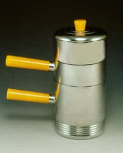
Rather than relying on just one or two designers for its output, Chase offered design assignments to many; at least 21 are known to have made contributions to the line. Some, like Director of Design Harry Laylon, his predecessor Helen Bishop Dennis, and Development Engineer Howard Reichenbach, were on the Chase payroll full-time. Others, such as Walter Von Nessen, Ruth and William Gerth, Lurelle Guild, Russel Wright, Rockwell Kent, and Dr. Albert Reimann, were given freelance contracts to create specific pieces. Their work demonstrated resoundingly that functional objects could also be attractive to the eye. Working within the same framework—metal giftware—each designer contributed his or her own unique vision.
In 1936, Walter Von Nessen told House Beautiful that “a designer today must be an inventor too” – and the designing minds at Chase were definitely inventive. Since other Chase divisions focused on the company’s more mundane tasks—producing such everyday necessities as plumbing pipe and electrical parts—discarded shells, elbow joints, and the like soon found their way to the Chase storeroom. It took an industrial designer to see the artistic possibilities inherent in these odds and ends. Efficient re-use of unlikely components by the giftware division proved a cost-effective means of fighting the Depression.
Director of Design Harry Laylon recalled that one of his ongoing assignments was to introduce guest designers to the Chase inventory warehouse, in hopes that a spare part might spark their imaginations. The success rate was astounding. A simple toilet floater, for instance, served as the focal point for a variety of products, including a “Syrup Jug.” Brass bedstead balls found new life as Russel Wright-designed salt and pepper spheres. And Walter Von Nessen’s “Diplomat Coffee Set,” on view in the movie Design for Living, and recipient of an “Award of Merit” from the National Alliance of Art and Industry, began life as an extruded chromium-plated pipe!
Industrial designers were, of course, much more than Deco Dr. Frankensteins, cobbling together spare parts in hopes of coming up with something marketable. Their task was to reinterpret standard household items in ways that would increase attractiveness, convenience, and marketability. As Russel Wright told Design magazine in 1933, “the designer can take a dull product lacking in sales appeal, and with the magic touch of artistic imagination vamp it into an exciting product packed with sales appeal.”
Decorative Deco

Adding additional charm to Art Deco homes were those objects created primarily (if not necessarily solely), for decorative purposes. Certainly, a Robj decanter or a Schneider vase performs a function, but so could a moonshine jug, or a jelly jar, and much less prettily. Enhancing the beauty of a specific home environment was their reason for being. That they could also actually prove useful was merely a pleasant side benefit. Many were “statement” pieces, purchased as gifts to mark an important occasion, such as an anniversary or a wedding.
Porcelain, glass, and metal decorative objects of the period highlight the ways in which old and new could co-exist – and co-exist they did. The dawn of Art Deco never resulted in a wholesale junking of all that came before. During the 1920s and ‘30s, the majority of American homes combined the familiar with the futuristic, an amalgam specifically suited to the needs and desires of the individual householder.
That analysis is borne out by the colorful interior illustrations which punctuated advertisements of the era. In the days before advertising photography was the norm, glamour art sold the product, placing each featured item in an idyllic locale. If you’re hawking something as mundane as a “Herman Nelson Invisible Radiator,” for instance, why not feature it in a boudoir illustration so lavishly enticing that the radiator itself becomes … well … invisible?
Many of these illustrations appeared in popular decorating magazines of the time, such as House Beautiful. Others came from consumer-oriented “helpful hints” publications, issued by specific manufacturers, such as Armstrong and Sherwin-Williams, or were splashed across the pages of that annual wish book, the Home Owners’ Catalogs.
In Deco-contemporary images such as these, modernistic and traditional design influences manage a harmonious meld, just as they did in actual Art Deco era homes. The image of a Gay ‘90s granny, warming up her starkly modern living room by draping a doily over the back of a tubular chair, made for an amusing Saturday Evening Post cartoon in the 1930s. In reality, however, the present augmented, rather than replaced, the past.

Durable Deco
“There is nothing more important in making a home out of a house than to be able to put into it
the qualities that mean livableness, restfulness, and your own individuality.”– Helen Koues, How To Be Your Own Decorator, 1926

Arthur von Frankenberg’s Manhattan-based studio was noted for its female nude statuettes, which graced everything from ashtrays and bookends, to clocks and candy bowls.
Livableness, restfulness, and individuality. What better blueprint for the ideal home, then and now? Exquisite Art Deco accessories, chosen to reflect individual taste, complement all that surrounds them. And, while there are many options to choose from, there is really only one question: which Art Deco items will enhance your personal environment? A happy fusion of old and new awaits today’s collectors, just as it awaited aspiring home decorators of the 1920s and ‘30s. In the Art Deco home, past and present combine. The result? An invigorating, visually stunning future.
Art Deco. It’s not all black and white.
“Remember: it costs no more to manufacture handsome products than it does to make ugly things.”
– Metal Industry, 1934
Photo Associates: Hank Kuhlmann, Ramón Piña
Donald-Brian Johnson (text) and Leslie Piña (photos) are the co-authors of numerous Schiffer books on art and design, including Deco Décor, and a 4-volume study of the Chase Brass & Copper Co. Please address inquiries to: donaldbrian@msn.com


